In any industry, process improvement is critical to achieving success and staying ahead of the competition. Utilizing the right tools and techniques is crucial to improve processes effectively. Quality tools are essential for identifying and solving problems, analyzing data, and making informed decisions. In this blog post, we will explore seven essential quality tools that can help you master the fundamentals of process improvement. From flowcharts and check sheets to control charts and Pareto diagrams, these tools will empower you to streamline processes, enhance efficiency, and drive continuous improvement within your organization. So, let us delve into the world of quality tools and take your process improvement efforts to new heights.
Table of Contents
- Introduction to Quality Tools for Process Improvement
- Cause and Effect Diagram
- Check Sheet
- Control Chart
- Histogram
- Pareto Chart
- Scatter Diagram
- Stratification
- Conclusion
Introduction to Quality Tools for Process Improvement
Quality professionals refer to a set of seven fundamental tools for quality control by various names such as “The Old Seven,” “The First Seven,” and “The Basic Seven.” These tools were initially highlighted by Kaoru Ishikawa, a renowned professor of engineering at Tokyo University and a pioneer of “Quality Circles.” To embark on a journey toward quality improvement, gaining proficiency in these tools is essential. Once mastered, these tools evolve from techniques to indispensable assets in quality management.
The seven quality tools are essential in driving process improvement crucial for the success and growth of any business. By using these tools, organizations can identify and correct inefficiencies, leading to enhanced productivity, reduced costs, and the delivery of higher-quality products and services. These tools offer a structured and systematic approach to analyzing, measuring, and improving a process’s different aspects. Integrating these tools into process improvement efforts can open doors to increased efficiency, greater customer satisfaction, and overall business success.
Cause and Effect Diagram
The Fishbone Diagram (also known as Ishikawa or Cause and Effect Diagram) gets its name from its shape, which resembles the skeleton of a fish. It consists of a horizontal line representing the problem or effect we want to analyze and several diagonal lines branching off from it. These diagonal lines resemble the bones of a fish and represent different categories of potential causes.

The Fishbone Diagram helps identify and categorize a problem’s root causes, making it easier to understand the factors contributing to the issue. By visually mapping out the causes, it allows for a more comprehensive analysis of the problem and helps to facilitate effective problem-solving.
Check Sheet
A check sheet, also known as a Defect Concentration Diagram, is a simple and structured data collection tool used in various quality improvement methodologies, including Lean and Six Sigma. It is designed to help organizations collect, organize, and analyze data systematically and efficiently. It systematically collects and organizes data, identifies patterns and trends, tracks defects and errors, and facilitates data visualization.
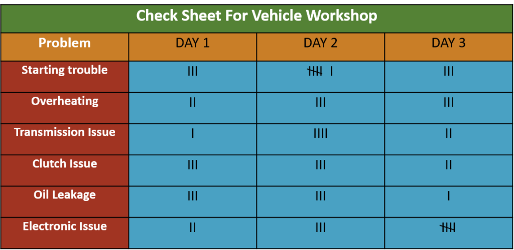
Creating a practical Check Sheet involves defining the event or issue, designing a user-friendly form, and pilot-testing it for suitability. Analyzing data from Check Sheets involves organizing, interpreting, quantifying, and visualizing the data, enabling continuous monitoring and improvement efforts in quality projects.
Control Chart
A control chart, also known as a Shewhart chart or a statistical process control chart, is a tool that tracks how things change over time. It is like a graph that records specific numbers or measurements regularly, such as the quality of products in a factory.
This chart has lines that show the normal range for these measurements. When people look at the chart, they can quickly see whether the measurements stay within the normal range or are going too high or too low. This helps in identifying issues early. For instance, if the measurements start to vary significantly, it might indicate a problem.
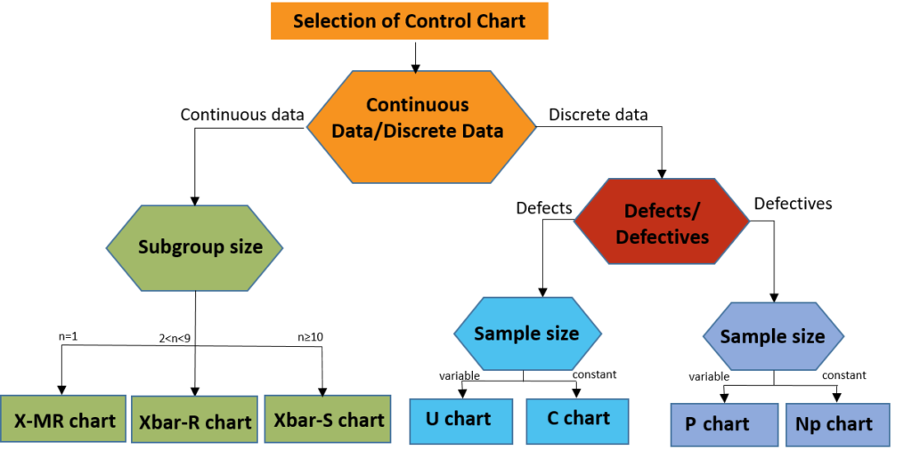
Using a control chart helps companies monitor their performance and maintain good quality. This leads to more efficient operations and increased customer satisfaction.
Histogram
A histogram is a graphical representation of data that uses bars to display the frequency or distribution of values within a given range. It visually depicts how data is distributed and allows us to identify patterns, trends, and outliers.
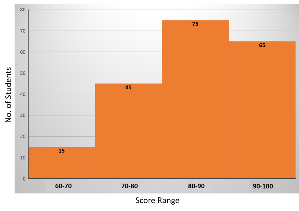
Histograms are vital for visualizing data distributions, helping us understand critical characteristics, such as central tendency, spread, and outliers. It facilitates data-driven decisions, but it is crucial to grasp the shape’s significance for accurate analysis.
Pareto Chart
A Pareto chart is a powerful tool in data analysis that can provide valuable insights and help prioritize actions. Named after Vilfredo Pareto, an Italian economist, Pareto charts are graphical representations of data highlighting the vital factors contributing to a problem or situation. The Pareto principle asserts that 80% of results stem from 20% of causes, widely applied in business and population studies.
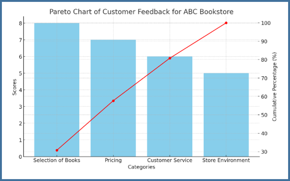
It consists of both a bar graph and a line graph. The bar graph displays the frequency or count of occurrences for different categories, while the line graph represents the cumulative percentage of the total. By arranging the categories in descending order of frequency, the chart enables us to identify the most significant factors contributing to a particular outcome.
Scatter Diagram
A scatter diagram, also known as a scatter plot or scatter graph, represents the relationship between two continuous variables. It consists of a series of points plotted on a graph, each representing the values of both variables. The horizontal axis typically represents one variable, while the vertical axis represents another.
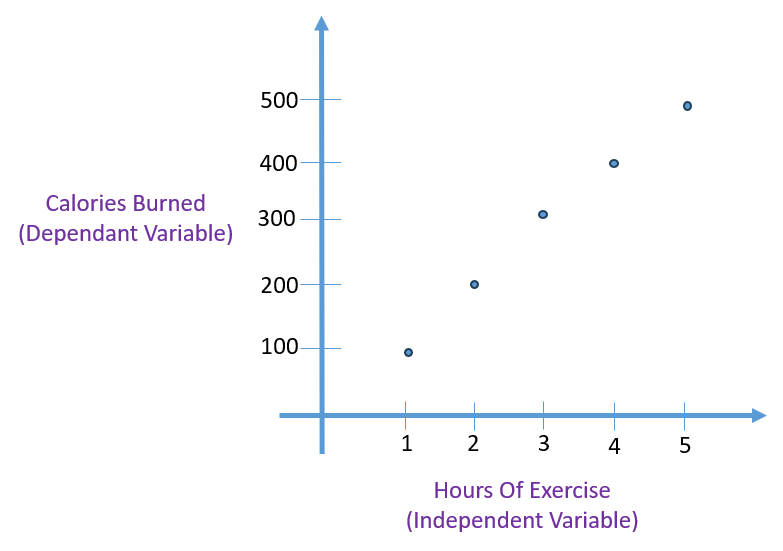
The primary purpose of a scatter diagram is to identify and understand the nature of the relationship between the two variables being plotted. It helps us determine whether there is a correlation or a pattern between the variables and whether it is positive or negative.
If there is a correlation between the variables, the data points will align with a line or curve. A stronger correlation is indicated by the data points being closely clustered around this line. This tool for root cause analysis is regarded as one of the seven fundamental quality tools.
Stratification
Stratification involves organizing data, individuals, or objects into distinct categories or layers. It’s a method often used alongside other data analysis tools to enhance understanding. When data from various sources or categories are mixed, discerning meaningful insights becomes challenging. Stratification helps in segregating this data, making it easier to identify patterns. Recognized as one of the seven fundamental quality tools, it’s crucial in data analysis.
Conclusion
In conclusion, the seven management quality tools are indispensable in process improvement and quality management. Each tool offers a unique perspective and analytical approach that, when used collectively, can provide a comprehensive understanding of processes, identify inefficiencies, and pinpoint areas for enhancement. By harnessing these tools, businesses can propel themselves toward sustained success, ensuring that they not only meet but exceed the expectations of their customers and stakeholders.
