
Histograms are a powerful visual tool in various fields, from data analysis to photography. They provide a clear and concise representation of a distribution, allowing us to understand our data’s underlying patterns and characteristics. In this comprehensive guide, we will unravel the mysteries of histograms, break down their components, explain their significance, and provide practical tips on creating and analyzing histograms. Whether you are a data enthusiast, a photographer, or simply curious about the world of histograms, this guide will give you with the knowledge and confidence to navigate and harness the insights hidden within these intriguing visual representations.
What is a Histogram?
A histogram is a graphical representation of data that uses bars to display the frequency or distribution of values within a given range. It visually depicts how data is distributed and allows us to identify patterns, trends, and outliers.
Importance of Histogram
- Provide a clear and concise summary of a data set.
- Aid in identifying central tendency and data spread.
- Detect skewness in the data distribution.
- Reveal underlying patterns and variations.
- Show the frequency of values within intervals.
- Help identify outliers or anomalies in the data.
- Support data exploration and understanding.
- Enable more informed decision-making.
- Contribute to accurate statistical conclusions.
Histogram Vs. Bar chart
Histograms and bar charts are frequently associated due to their column-based visual representations. Nevertheless, it is essential to note the technical distinction: histograms depict the frequency distribution of data variables, whereas bar charts are generally used for visual comparisons involving discrete or categorical variables.
Understanding the components of a histogram
To fully comprehend histograms, it is essential to break down the components of this powerful data visualization tool. At its core, a histogram is a graphical representation of the distribution of a dataset.
The X-Axis and Bins
The first critical component to understand in a histogram is the x-axis. This axis represents the range of values or intervals within the dataset. The x-axis is divided into bins, small segments that group data points together. These bins help organize the data for a more meaningful visualization.
The Y-Axis and Frequency
Moving on to the y-axis, it represents the frequency or count of data points that fall within each bin. The height of each bar in the histogram corresponds to the frequency of data points within that particular bin. In simple terms, the taller the bar, the higher the frequency of data points within that range.
Width of the Bars
The width typically represents the range or interval of each bin. Selecting an appropriate width is essential to depict the data distribution accurately. A narrower width can provide more detail but may result in a cluttered or jagged histogram. On the other hand, a wider width can smooth out the histogram but may sacrifice some level of detail.
Overlays and Additional Information
It is worth mentioning that histograms can display additional information through overlays. For instance, a line representing a standard distribution curve can be added to the histogram, aiding in identifying deviations from the expected pattern. This feature enhances the interpretive power of histograms.
How to create a histogram
- Collect Data: Gather at least 50 consecutive data points.
- Define Range: Determine the range of values to include.
- Choose Bin Width: Decide the width of each bin.
- Create Axes: Draw x and y-axes.
- Label Intervals: Label x-axis intervals based on bin width.
- Count Data in Bins: For each bin, count data points.
- Plot Bars: Use counts to plot histogram bars.
- Enhance Presentation: Add a title, label axes, and provide explanations.
- Finalize Histogram: Your histogram is ready for use.
Interpreting and analyzing histograms
The following are the critical points for interpreting and analyzing histograms:
Histogram Overview:
A histogram is a graphical representation of data distribution, displaying the frequency or count of values within a specified range.
Distribution Shape:
The shape of the histogram provides essential insights. It can be symmetrical (indicating a normal distribution), skewed left, or skewed right, offering clues about the nature of the data.
Central Tendency:
Identify the histogram’s peak or mode to determine the data’s central tendency. Multiple modes may indicate a bimodal or multimodal distribution.
Spread or Variability:
The histogram bar’s width reflects the data’s spread or variability. A wider spread suggests a more extensive range of values, while a narrower spread indicates a more concentrated distribution.
Outlier Detection:
Examine the data for outliers, values significantly different from the majority. Outliers can impact the overall interpretation and shape of the histogram.
Comparative Analysis:
Comparing histograms can reveal differences or similarities between different data sets. Overlaying multiple histograms enables visual comparisons, highlighting variations in distributions.
Histogram shapes and their meaning
Normal Distribution (Bell Curve)
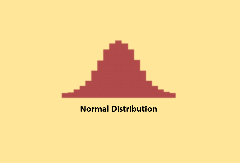
In a normal distribution, data follows a classic bell-shaped curve. This means that most data points are likely to be close to the average, with roughly equal numbers above and below. It is important to note that ” normal ” refers to a specific pattern in a particular process. Other processes may exhibit different shapes. Statisticians use calculations to confirm whether a distribution is expected. In some cases, processes have natural limits on one side, which can result in skewed distributions. So, “normal” does not always mean perfectly symmetrical.
Skewed Distribution (Asymmetrical)
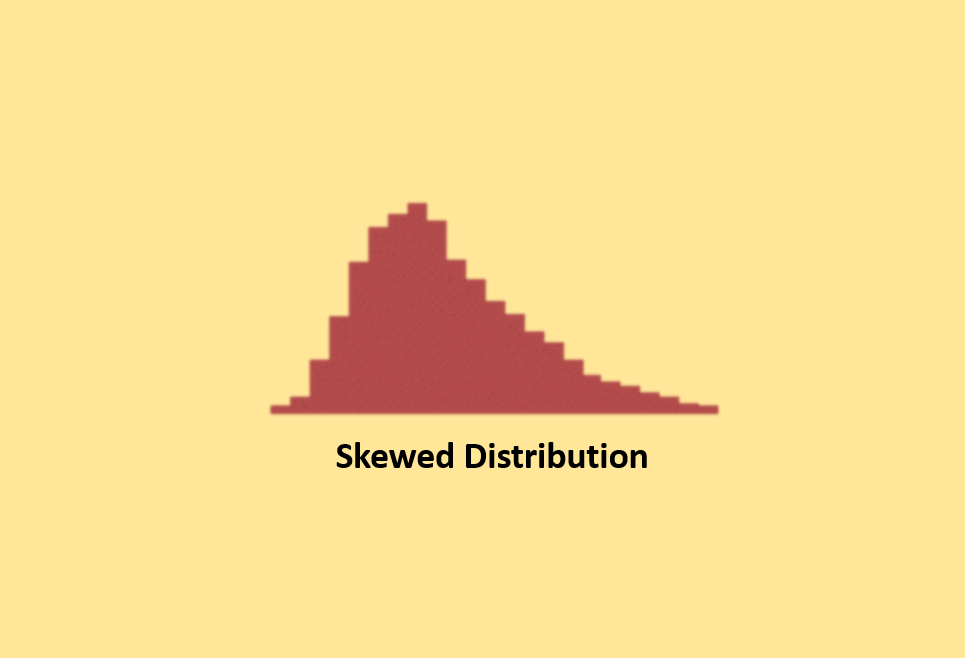
Skewed distributions are not balanced. They lean towards one side because natural limits or constraints affect the data. For example, if you are measuring the purity of a substance, it can be at least 100%, creating a skew in the data. These skewed distributions can be either left-skewed or right-skewed, depending on the direction of the tail.
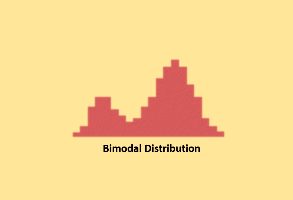
Double peaked or Bimodal Distribution
The bimodal distribution resembles the posterior view of a camel with two distinctive humps. It occurs when a single dataset combines outcomes from two distinct processes, each having its unique distribution. For instance, production data from a two-shift operation can exhibit a bimodal distribution if the two shifts yield different sets of results. The issue is often brought to light through stratification.
Multimodal Distribution (Plateau)
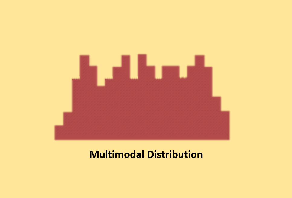
Multimodal distributions, also known as plateau distributions, occur when you combine several normal-like distributions. This results in a unique shape where multiple peaks are clustered closely together, forming a plateau-like appearance.
Edge Peak Distribution
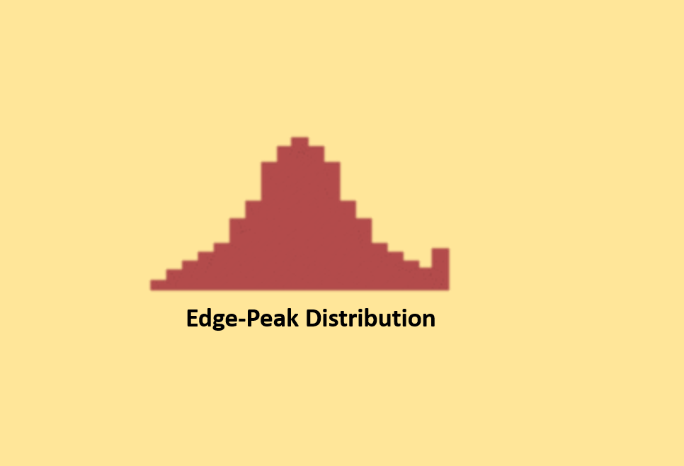
Edge peak distributions look similar to normal distributions but have a more prominent peak at one end. This is often a result of errors in how data is presented in a histogram.
Comb Distribution
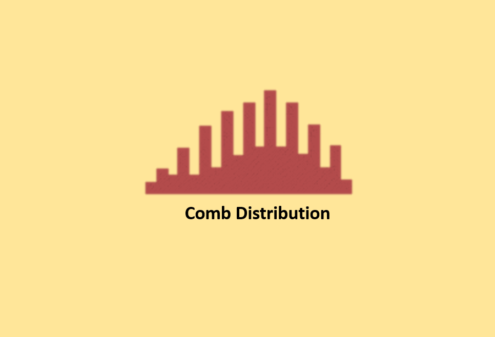
Comb distributions are characterized by alternating tall and short bars in a histogram. This peculiar pattern usually arises when data is rounded off, or the histogram is drawn incorrectly. For example, if you round temperature measurements to the nearest 0.2 degrees and create a histogram with bars of 0.1-degree width, it may result in a comb-like shape.
Truncated Distribution
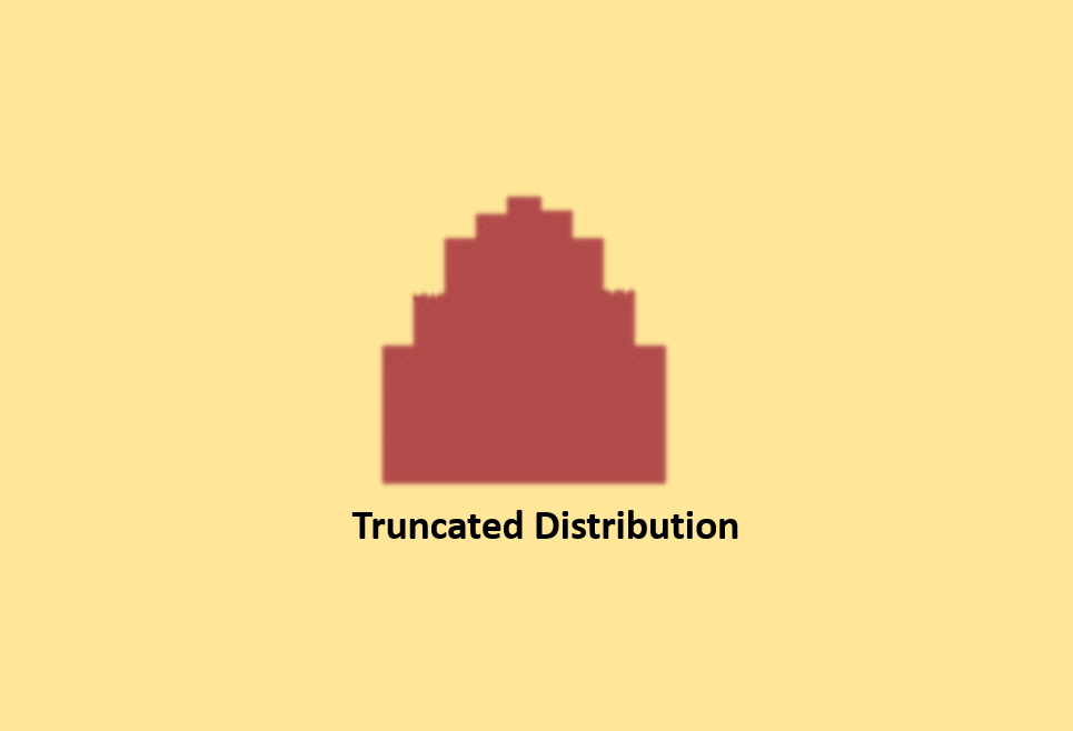
A truncated distribution closely resembles a normal distribution, but its tails are cut off. This typically occurs when you have a process that initially produces a normal product distribution. However, you impose limits during quality control, and only the part within those limits is considered for distribution.
Dog Food Distribution
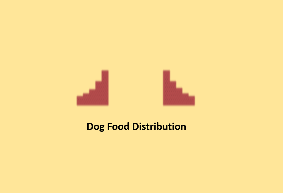
Dog food distribution is characterized by having gaps, even though it is centered around the average. This can create issues when using the data because it needs more consistency. It is like one person getting the best part, another getting a good part, and the last getting the leftovers, creating disparities even when all data falls within specified limits.
Example:
Let’s take an example of the number of students who scored within certain score ranges in a test. The following table shows the scores of 200 students in a math test.
| Score Range | Number of Students |
| 60 – 70 | 15 |
| 70 – 80 | 45 |
| 80 – 90 | 75 |
| 90 – 100 | 65 |
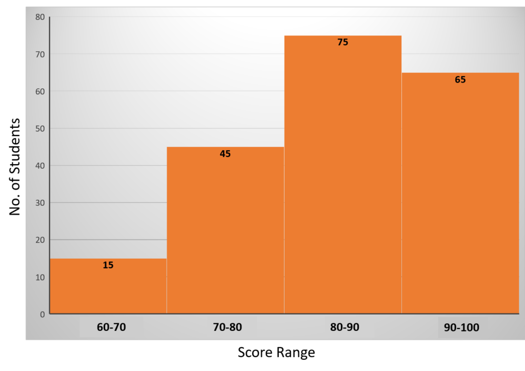
To create a histogram, follow these steps:
- Determine the Range and Intervals: First, define the score ranges (intervals) and the number of students falling within each range.
- Create the x and y Axes: Draw the x-axis horizontally to represent the score ranges and the y-axis vertically to show the count of students.
- Label the Axes: Label the x-axis with the score ranges and the y-axis with the number of students.
- Plot the Bars: Plot a bar on the histogram for each score range. The height of each bar corresponds to the number of students in that range. So, for “60 – 70” with 15 students, you would draw a bar at 15 on the y-axis. Similarly, you would create bars for the other score ranges.
Conclusion
Histograms are vital for visualizing data distributions, helping us understand critical characteristics, such as central tendency, spread, and outliers. They differ from bar charts as they focus on numerical data. Creating a histogram involves data collection, range definition, bin width selection, and plotting. Interpretation considers shapes like normal, skewed, bimodal, and more, shedding light on data patterns. Histograms facilitate data-driven decisions, but it is crucial to grasp the shape’s significance for accurate analysis.