Scatter diagrams, also known as scatter plots, are powerful tools that provide valuable insights into the relationship between two variables. Whether you’re a student learning about data analysis or a professional looking to enhance your analytical skills, understanding scatter diagrams is essential. This comprehensive blog post will demystify scatter diagrams by explaining their purpose, illustrating how to create and interpret them, and providing real-life examples to solidify your understanding. By the end of this article, you will have the knowledge and confidence to implement scatter diagrams effectively in your analysis, helping you uncover meaningful patterns and correlations in your data.
What is a Scatter Diagram?
Also known as a Scatter plot chart, an XY chart, or a Correlation chart
A scatter diagram, also known as a scatter plot or scatter graph, represents the relationship between two continuous variables. It consists of a series of points plotted on a graph, each representing the values of both variables. The horizontal axis typically represents one variable, while the vertical axis represents another.
The primary purpose of a scatter diagram is to identify and understand the nature of the relationship between the two variables being plotted. It helps us determine whether there is a correlation or a pattern between the variables and whether it is positive or negative.
If there is a correlation between the variables, the data points will align with a line or curve. A stronger correlation is indicated by the data points being closely clustered around this line. This tool for root cause analysis is considered one of the Seven fundamental quality tools.
When to use a Scatter diagram?
- To demonstrate the relationship between two variables.
- To identify patterns within paired numerical data.
- When the dependent variable can have multiple values for each independent variable value.
- To ascertain if there is a correlation between two variables.
- For identifying potential root causes of problems.
- To objectively verify the relationship between causes and effects identified in a fishbone diagram.
- To determine if the same factor causes two effects that seem related.
- In testing for autocorrelation before creating a control chart.
- In fields like Lean Management for root cause analysis.
- In Economics, to show relationships between economic phenomena like employment and output.
- In Management for visualizing the impact of product inventories on costs or delivery times.
- In Market Research, to analyze the relationship between advertising methods and sales.
Benefits of Scatter Diagram
- It clearly illustrates the relationship between two variables.
- It effectively reveals non-linear patterns.
- It helps confirm hypotheses about the relationship between variables.
- It shows the range of data, including maximum and minimum values.
- It makes patterns in the data accessible to observe.
- It is straightforward to plot.
- It establishes connections between two sets of numerical data.
- It tracks and displays trends and patterns in various measures.
Types of Scatter Plots

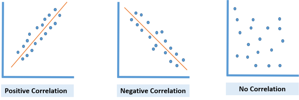
Positive Correlation Scatter Plot:
This type of scatter plot shows that as one variable (X) increases, the other (Y) increases. The plot displays a positive relationship between the two variables. When a line is drawn through the data points, it slopes upwards. For instance, as the temperature drops, sales of hot beverages might increase, illustrating a positive correlation.
Negative Correlation Scatter Plot:
In this plot, as one variable’s value (X) increases, the other (Y) decreases. This indicates a negative correlation. The slope of the line drawn through these data points will be downward. An example of this could be seen in a workflow where an increase in cycle time leads to a decrease in the number of tasks completed.
No Correlation Scatter Plot:
This plot shows no visible relationship between the two variables. The data points are spread randomly, making drawing a meaningful line through them impossible. This indicates no correlation or a zero degree of correlation between the variables. An example is the lack of a relationship between hotter weather and the sales of wooden chairs.
Scatter Diagram Procedure
1. Gather data pairs where you suspect there is a relationship.
2. Create a graph and put the independent variable on the horizontal axis (x-axis) and the dependent variable on the vertical axis (y-axis). Plot each data pair as a dot where the x and y values meet. If two dots overlap, place them close together.
3. Examine the dots. If they form a precise line or curve, the variables are likely correlated, and you can consider further analysis like regression or correlation. If not, continue to the next steps.
4. Divide the graph into four sections (quadrants) by drawing a horizontal and a vertical line:
- Count half number of dots from the top for the horizontal line and draw the line there.
- For the vertical line, count half from the left side.
- If there is an odd number of dots, include the middle dot in these lines.
5. Count the dots in each quadrant, ignoring those on the lines.
6. Add the dots from opposite quadrants:
- A = dots in the top left and bottom right
- B = dots in top right and bottom left
- Q = the smaller number between A and B
- N = total number of dots (A + B)
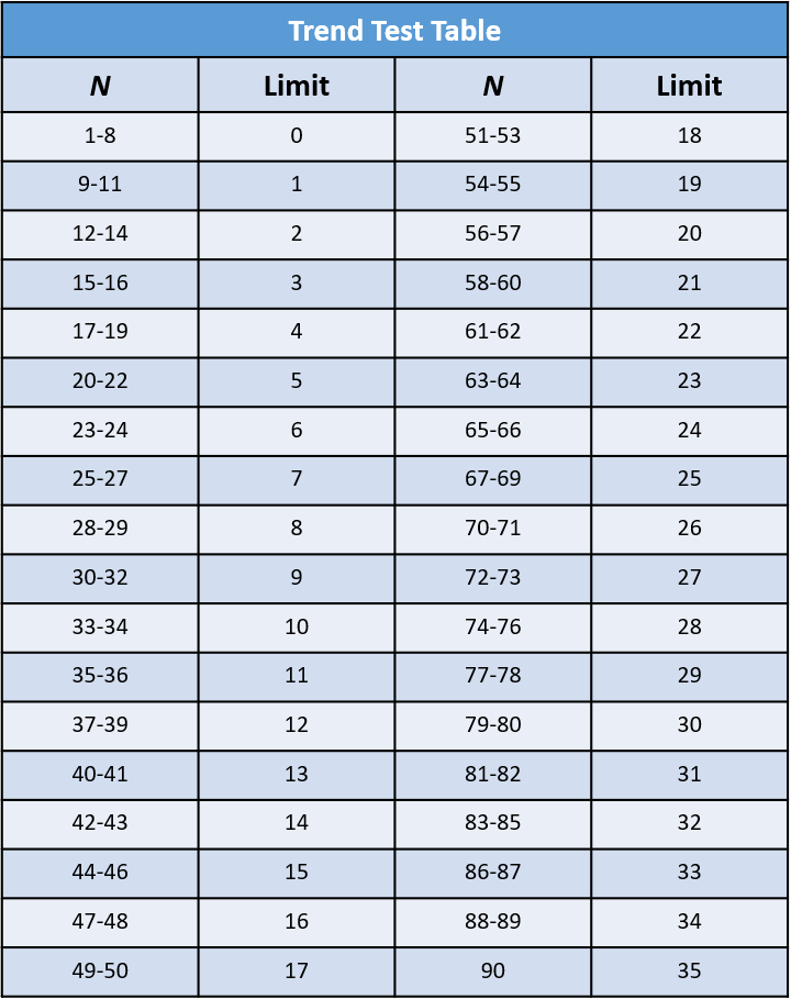
7. Refer to a trend test table for the limit value for N.
- If Q is less than the limit, it suggests the variables are related.
- If Q is the same or greater than the limit, the pattern might be just by chance.

Scatter Plot in Six Sigma
Scatter plots are essential in Six Sigma methodologies for their effectiveness in demonstrating the relationships between variables. These two-dimensional graphs are handy for illustrating non-linear associations.
In the context of Six Sigma, scatter plots are employed to discern the type of correlation, whether positive, negative, or none, between potential causes and outcomes. The correlation on the scatter plot can provide insight into how changes in one variable might affect another, which is crucial for quality control teams. By analyzing the plots, teams can prioritize which potential causes of a problem may have the most significant impact and, therefore, should be addressed first.
Considerations for Interpreting Scatter Diagram
- A correlation does not imply causation, unseen factors may be at play.
- A straighter line indicates a stronger correlation.
- When lines are not noticeable, use statistical tests to confirm any correlation.
- No visible relationship may require data stratification for clarity.
- The lack of correlation could be due to a limited range of independent variables.
Example of Scatter diagram
Let’s take an example to understand how to make a scatter diagram.
Question:
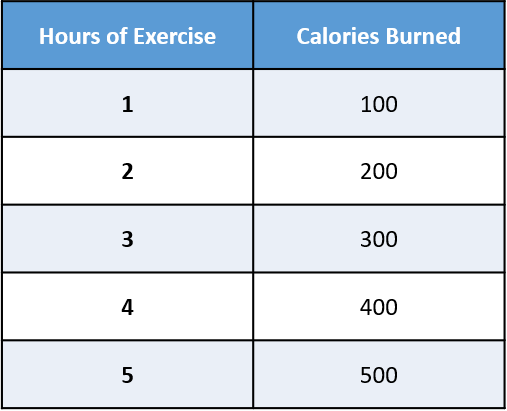
Explore the relationship between the number of hours of exercise and the calories burned.
Solution:
The collected data on the number of hours of exercise and the corresponding calories burned on different days is as follows:

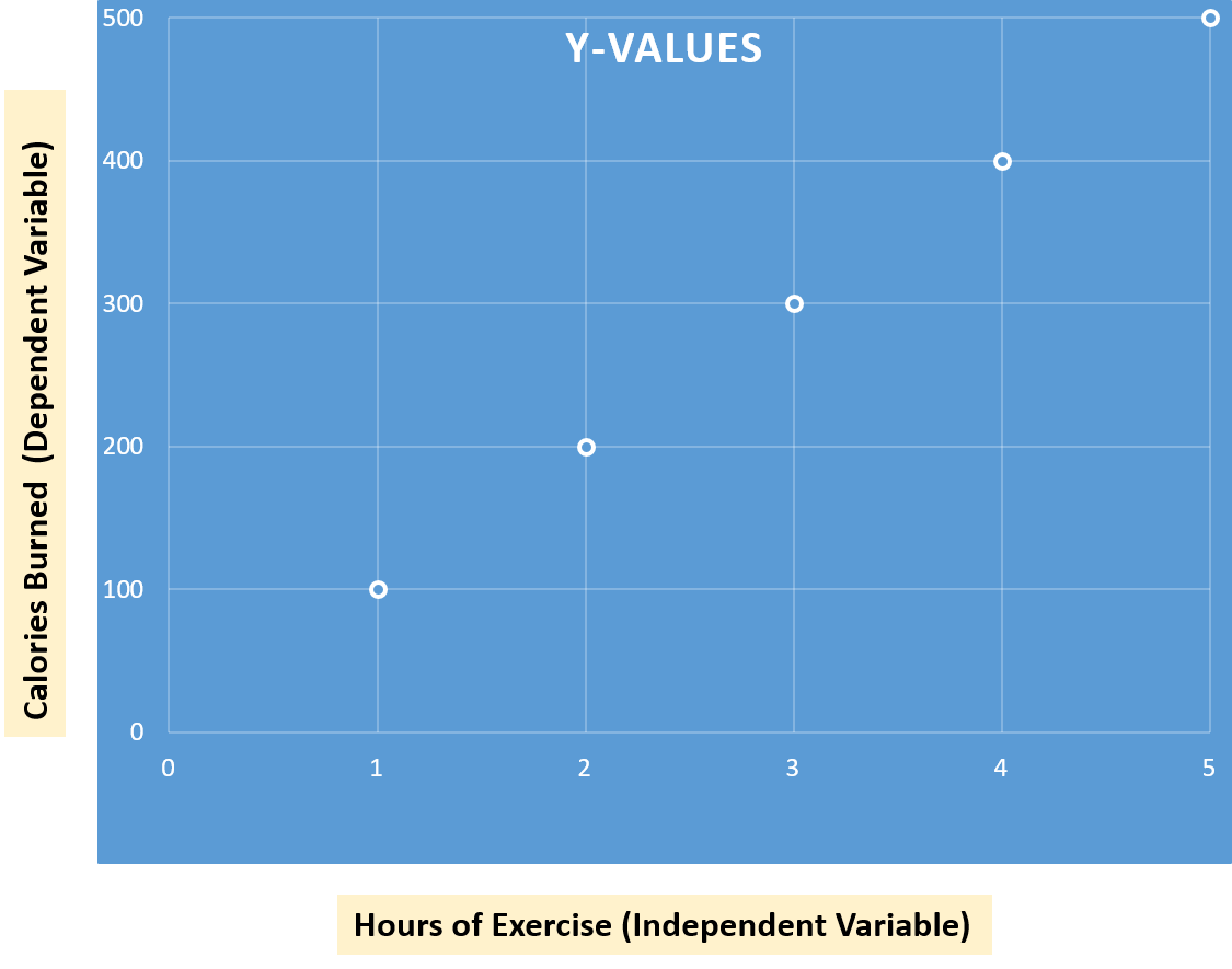
- X-axis or horizontal axis: Hours of exercise (independent variable)
- Y-axis or vertical axis: Calories burnt (dependent variable)

As we observe the scatter plot, it becomes evident that there is a positive correlation between the number of hours of exercise and the calories burned. In other words, as the hours of exercise increase, the calories burned also increase. This positive correlation suggests a direct relationship between the two variables, emphasizing that more exercise leads to more calories burned.
Following are some more examples of situations where you might find a scatter diagram useful:
Product Price and Sales Volume:
- Variable A: Price of a product.
- Variable B: Monthly sales volume for the product.
- Plot product price and monthly sales volume on a scatter diagram.
Employee Training and Productivity:
- Variable A: Number of hours of training received by employees.
- Variable B: Individual or team productivity levels.
- Draw scatter diagram to illustrate the potential relationship between employee training and productivity.
Conclusion
In summary, a scatter diagram, or scatter plot, is a visual tool representing the correlation between two continuous variables. It helps identify patterns and trends in data, which is crucial for fields ranging from project management to Six Sigma. Positive correlation plots show an upward trend, negative plots exhibit a downward trend, while no correlation plots display randomness. Scatter diagrams provide a straightforward way to confirm hypotheses, track trends, and understand complex relationships within numerical data sets.
