

Data visualization is a powerful tool for understanding and interpreting complex information. One such visualization method widely used in statistical analysis is the box and whisker plot. This simple yet highly informative graph provides a visual summary of a data set, allowing us to identify critical statistical measures, detect outliers, and compare multiple data sets. This article will delve into box and whisker plots, exploring their purpose, drawing techniques, and advantages. Whether you’re a student, scholar, or data professional, grasping this visual depiction will empower you to make well-informed choices and acquire valuable insights from your data. So, let’s unveil the box and whisker plot and uncover its hidden treasures!
What is a box and whisker plot?
Also called: box plot, box and whisker diagram, box and whisker plot with outliers
A box and whisker plot is a visual representation of a set of data that provides valuable insights into its distribution and variability. Usually, a histogram analysis is enough to show data, but a box and whisker plot can offer more details and the advantage of displaying multiple sets of data on a single graph.
It is a powerful tool for visualizing and understanding data distribution. The quartiles, median, and range provide valuable information about the dataset’s spread and variability. With its ability to identify outliers and compare multiple datasets, box plots are valuable in statistical analysis and data interpretation.
Advantages of using box and whisker plot
Effective Data Summarization:
They efficiently summarize and compare multiple datasets in a single graph, making them a valuable tool for data analysis. They represent the distribution of a dataset, with a focus on critical statistical values like the median, quartiles, and outliers.
Five-Number Summary:
These plots illustrate the five-number summary of data, including the minimum, first quartile, median, third quartile, and maximum. This provides an intuitive understanding of data spread and central tendencies.
Pattern Identification:
Analysts, researchers, and decision-makers can quickly identify patterns, variations, and potential outliers within a dataset using box and whisker plots.
Skewness and Symmetry:
Box and whisker plots offer data skewness and symmetry insights. The length of the whiskers and the median’s position within the box help determine whether data is usually distributed, skewed, or contains extreme values.
Informed Decisions:
This information is valuable for making informed decisions, detecting data quality issues, and identifying anomalies.
Versatility in Data Types:
Box and whisker plots can handle various data types, including numerical, categorical, and time-series data. They can compare distributions across categories or groups, facilitating trend and difference analysis.
Accessible and Interpretable:
These plots can be easily understood by individuals with varying levels of statistical knowledge, making them applicable across diverse fields such as education, healthcare, business, and finance.
Box and whisker plot Procedure:
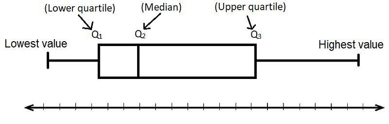
1. Numerical Data:
Begin with a set of numerical data you want to represent graphically.
2. Arrange Data:
Arrange the data in ascending order. This will help you identify the minimum and maximum values.
3. Minimum and Maximum Value:
The smallest value in the dataset will be the minimum, and the most significant value will be the maximum.
4. Find the Median:
- The median represents the central value in a dataset when the number of values is odd.
- If the dataset has an even number of values, calculate the average of the two middle values to find the median.
5. Determine Lower and Upper Quartiles:
- The lower quartile is the middle value of the lower 50% of the dataset.
- The upper quartile is the middle value of the upper 50% of the dataset.
6. Divide the Data:
The quartiles divide the dataset into four equal parts.
7. Draw the Number Line:
Draw a number line that spans the range of your data.
8. Create the Box:
- Place a box above the number line.
- Mark the median inside the box.
9. Add Whiskers:
Extend lines (whiskers) from the box to represent the minimum and maximum values.
10. Plot Outliers:
Add outliers or extreme values by plotting individual points outside the whiskers.
11. Label the Plot:
Make sure to label your plot clearly, including the title, axis labels, and any necessary explanations of the data it represents.

Following these steps, you can create a visually informative box and whisker plot representing your dataset.
Examples and Applications
Example #1
Let us say we are analyzing the annual income distribution for a company. By creating a box and whisker plot, we can quickly identify the median income, the payments range, and potential outliers. This information can be invaluable for budgeting, salary negotiations, and identifying discrepancies in income distribution. In the healthcare industry, the box and whisker plot can represent data related to patient outcomes.
Example #2
For instance, a hospital may use this plot to analyze the distribution of patient recovery times after a specific surgery. Healthcare professionals can identify trends, compare treatment options, and utilize factual information to make decisions that enhance the quality of patient care by observing the quartiles, medians, and outliers.
Example #3
The box and whisker plot is also widely used in market research to analyze consumer behavior. For instance, companies often use this plot to visualize and compare sales data across different regions or product categories. The plot can provide valuable insights into sales performance, identify potential outliers or anomalies, and inform marketing strategies accordingly.
Conclusion
In conclusion, the box and whisker plot, or box plot, is a compelling data visualization tool with many applications across different fields. Its ability to succinctly represent data distribution, identify key statistical measures, and detect outliers makes it valuable for researchers, analysts, and decision-makers. Following a straightforward step-by-step process, anyone can create an informative box and whisker plot to gain insights from complex datasets. Whether used in finance, healthcare, market research, or any other industry, this visualization method empowers individuals and organizations to make data-driven decisions, enhance understanding, and unlock hidden insights, ultimately contributing to more informed and effective choices in today’s data-driven world.