In the business world, processes are the backbone of efficiency and productivity. However, understanding and visualizing these processes can often be a complex and challenging task. This is where spaghetti diagrams come in. A spaghetti diagram is a powerful tool that allows you to map out and analyze the flow of people, materials, and information within a process. By creating a visual representation of the process, you can identify bottlenecks, areas of inefficiency, and opportunities for improvement. In this blog post, we will dive deep into the world of spaghetti diagrams, exploring what they are, why they are important, and how to create them. We will also provide you with real-life example to help you better understand the concept and apply it to your own business processes. So, let’s untangle the complexity and gain a clearer understanding of processes through the power of spaghetti diagrams.
Spaghetti Diagram
Also known as a Spaghetti Chart or Model
A Spaghetti Diagram is a tool for visually mapping the flow of activities or processes to pinpoint improvement areas. It tracks the movement of people, products, and documents, highlighting inefficiencies. Often used in settings where roles aren’t clearly defined, or standard procedures are lacking, it reveals excessive movements on the floor that can reduce productivity. This diagram aids in redesigning layouts to minimize unnecessary movements, thereby enhancing efficiency.

As a process analysis tool, the continuous flow line helps process teams pinpoint unnecessary steps in the workflow and opportunities to streamline the process for faster operation. Waiting is identified as one of the eight wastes in lean methodology, categorized as “unnecessary motion.” The spaghetti diagram is a valuable tool for drawing attention to significant intersection points that might go unnoticed.
It takes its name from the resemblance of the lines and paths created on the diagram to a plate of tangled spaghetti.
Benefits of Spaghetti Diagram
- Simplify understanding of complex process flows
- Reveal inefficiencies and areas of waste
- Enhance workplace safety
- Improve team communication and collaboration
- Facilitate continuous process improvement
- Support informed decision-making
- Reduce costs and save time
- Guide workspace layout optimization
- Enable progress monitoring of improvements
- Necessitate management support for implementation
Disadvantages of Spaghetti Diagram
- Limited to mapping only physical movements
- Risk of oversimplifying complex processes
- Challenging to use in large environments
- Represents a static view, not accommodating dynamic changes
- Needs regular updates to stay relevant
- Subject to varying interpretations by different individuals
- Relies heavily on the accuracy of initial mapping, prone to human error
Spaghetti Diagram Procedure
1. Choose a specific process for improvement.
2. Gather tools like floor plans, colored markers, stopwatch, measuring tape, and assemble the team.
3. Draw a scaled layout of the process area, including all relevant elements.
4. Record the movement of employees or materials throughout the process.
5. Use continuous lines in different colors to represent various movements.
6. Measure the time or distance of each path and note important details.
7. Design a revised diagram showing an improved, more efficient process.
8. Continuously update the diagram for ongoing process changes and improvements.
9. Involve the team in both the creation and analysis of the diagram.
Spaghetti Diagram Example
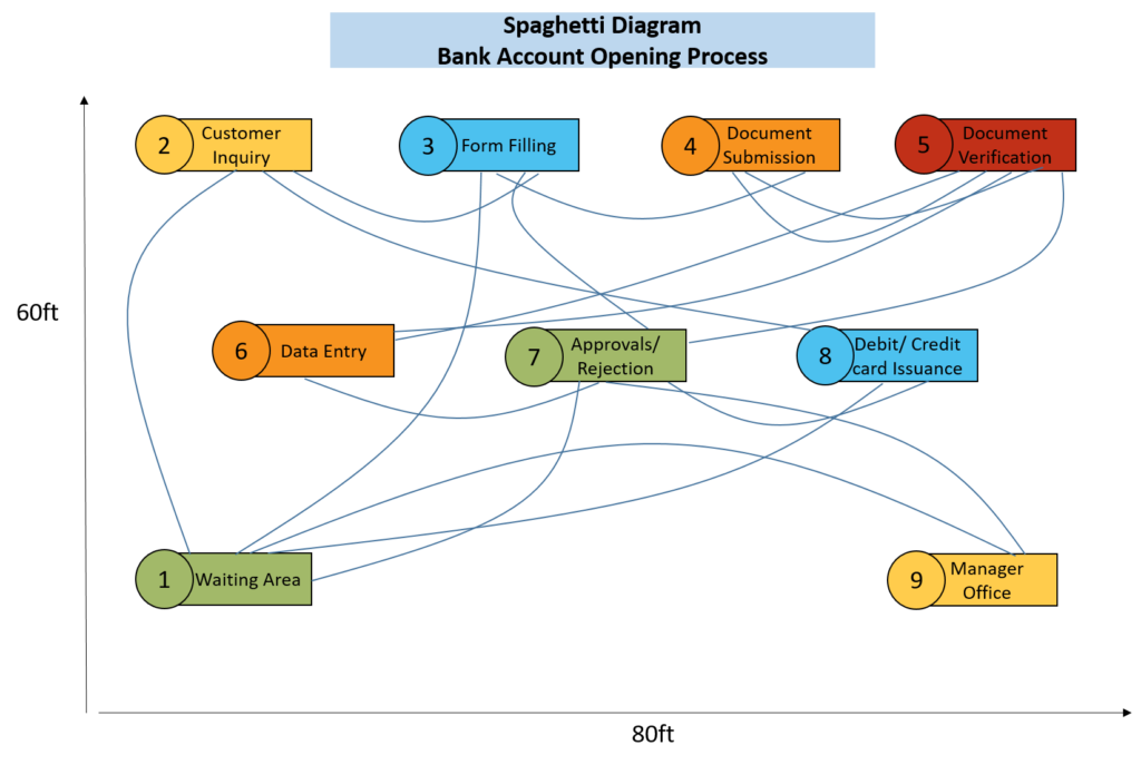
Let’s create a spaghetti diagram for the bank account opening process. This process typically involves several steps, including customer interactions, document verification, and internal processing.

The spaghetti diagram proves instrumental in evaluating the bank account opening process. The visualization highlights potential issues such as unnecessary back-and-forth in document handling, delays in account approval, and lack of streamlining in card issuance. Leveraging these insights, the bank can implement targeted improvements. By streamlining document submission, verification, and data entry, the process becomes more efficient. Automation of document verification expedites approvals, reducing processing time. Optimization of card issuance enhances the overall customer experience with faster delivery.
The spaghetti diagram, through its visual representation, provides a roadmap for efficiency enhancements, ensuring a smoother and more satisfying account opening process for customers while allowing the bank to operate with increased effectiveness.
Conclusion
A spaghetti diagram is a visual tool for analyzing and improving process flows by mapping the movement of resources within a workspace. It simplifies complex processes, identifies inefficiencies, and supports continuous improvement. While beneficial, it has limitations, and creating one involves selecting a process, mapping movements, and ongoing updates. Overall, it’s a practical aid for organizations seeking to optimize workflows.


